Cactus Hash provides a wide variety of sourcing and purchasing services within the cryptocurrency mining industry as well as expertise on setting up, managing, and maintaining a crypto mining rig* and/or mining farm*.
*Computer systems created and set up for mining/generating different types of cryptocurrencies.
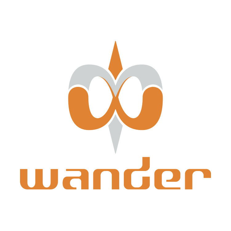
Wander
Remote GPS Tracking
Initially created for a Kickstarter campaign, the Wander logo was designed to represent the Wander GPS device. The GPS is both an analog and digital product, combining the aesthetic of a professional compass, with the digital GPS capabilities of a remote GPS tracker, for use in case of emergency or to share ones location/journey through a variety of social media platforms.
The logo is comprised of two parts. The first being the needle that represents the analog aspect of past exploration and a well trusted standard of adventurers for hundreds of years. And second, the infinity symbol that represents the limitless exploration capabilities that this modern GPS device gives the user.
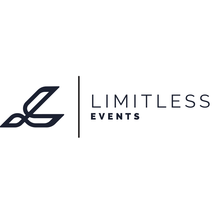
Limitless Events
Event & promotions company
Event companies deal with a multitude of clients and event categories, and Limitless needed a logo to represent their “limitless” capabilities within the event & promotions industry. The mark combines an abstract rendition of the infinity symbol warped and overlapped to create the shape of an L for Limitless. The logo gives a feel of sleek modernism, forward movement, and an almost racing/Formula 1 aesthetic.
Shovel
financial assistance
Shovel aims to help people and small business with financing and accounting needs. The goal for their logo was to create something rounded/soft combined with a professional/financial appeal to both comfort and reassure their clients of their personal, yet professional, approach to financial assistance.
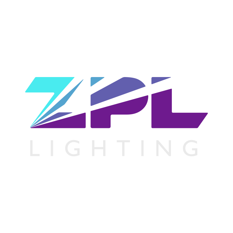
ZPL Lighting
EVENT LIGHTING & PRODUCTION
Based out of Syracuse, New York, ZPL Lighting provides lighting, laser, and stage production for events and clubs within the greater New York/Northeast region of the US. The owner wanted a simple acronym design, and we were happy to create this unique ZPL lettermark with light beams represented within the negative space, and then a cool-hue color gradient going from a bright turquoise into a deep purple base.
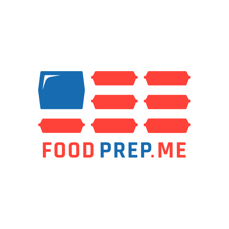
FoodPrep.Me aims to meet the constantly growing demand of easy-to-build food prep systems across the US. By appealing to both fitness and weight loss segments of the market, they aim to bring people into a healthier lifestyle through a wide selection of meal types and dietary options.
The logo is meant to represent the US flag made from the specific/well recognizable meal prep containers used industry wide.