Ediquette was created by High Grade AZ to be their new line of medical & recreational marijuana edibles within the Arizona market. Lifeform was commissioned to create the initial logo and packaging designs to launch their product line that is constantly growing today.
The goal for the brand was to create a sophisticated and clean identity to match their elevated edible experience, and we worked together with the High Grade team to create an amazing identity with flexibility for a wide variety of products.
Services Provided:
Brand Development
Logo Design
Package Design
Brand Development
With a desire to have a bold appearance, while still leaning into a more high-end style, we customized the font Regina Black to create a modern serif logotype as well as the main E icon. By taking the curved wispy shape from the E emblem, we were able to also use that small element as the tail of the Q in “Ediquette” to bring more cohesive visual style into the main identity pieces.
Once the initial brand elements were created, we then began to explore appropriate layout and usage in many types of collateral and packaging pieces.
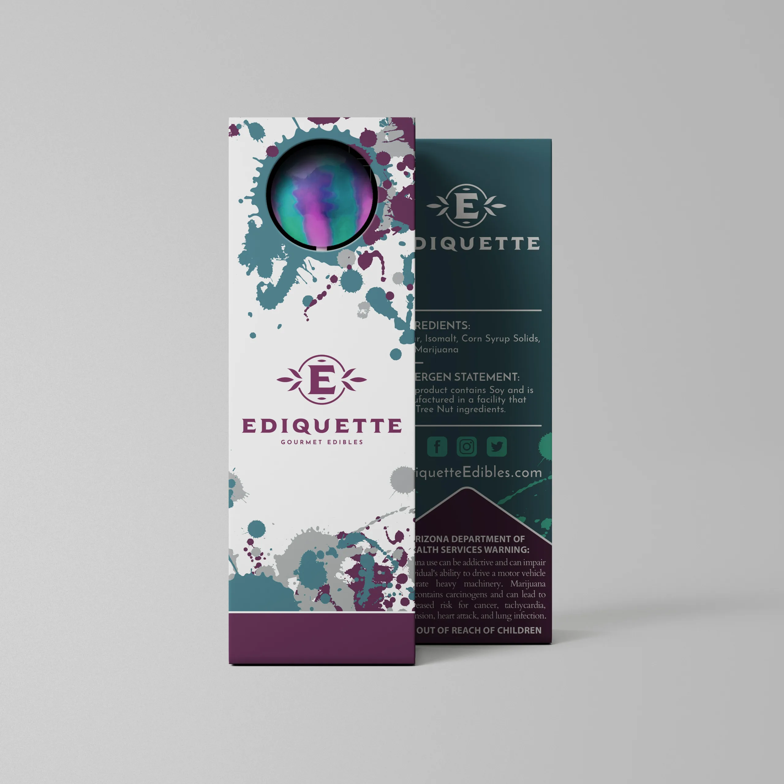
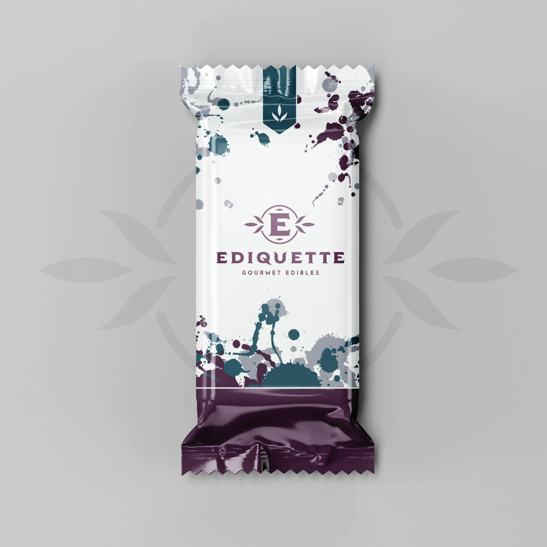
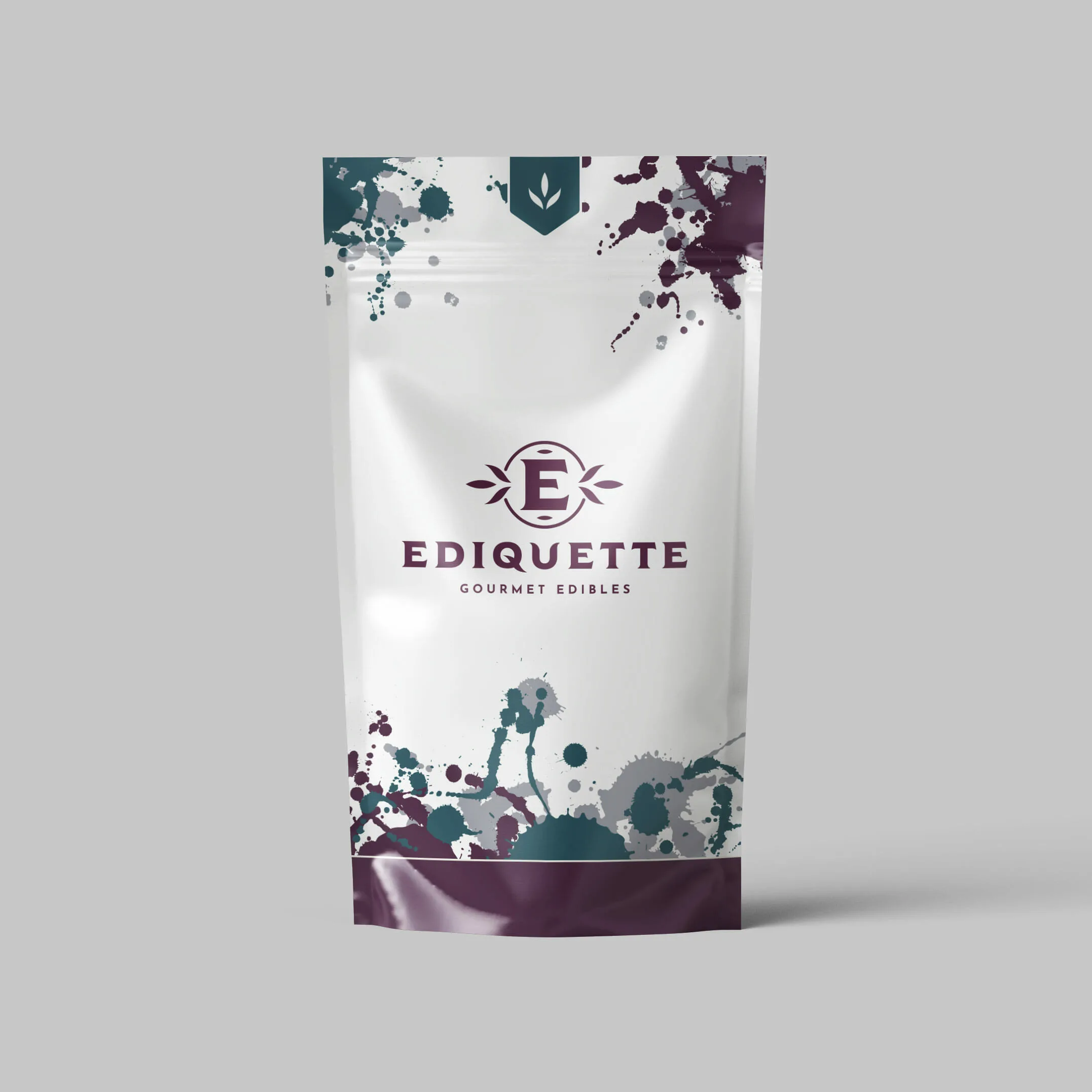
While the branding was a major component to this project, the look and feel of the packaging design was the most extensive and important.
The final look too influence from the hand made truffles that Ediquette’s in-house chef was experimenting with. The paint splatter effect on the edges of the packaging bring to mind hues of the AZ mountains during sunset, and even hark back to vintage Arizona Diamonback’s colors.
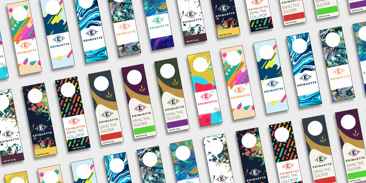
Here are some of the many design styles and color schemes that were experimented with before coming to the final design.