Medtech AZ aims to provide amazing servicing and repairs to a wide range of medical practices within the greater Phoenix area and throughout the Southwest.
To meet that goal and to launch the company, they required new branding and an easy-to-use website to get things moving, and Lifeform was their go to branding agency to help bring life to their business.
Services Provided:
Brand Development
Logo Design
Web Design
Brand Development
Finding a new way to combine well known objects and elements was a fun challenge when creating the Medtech logo. Our design solution uses overlapping wrench graphics with a medical cross in the negative space to fully represent Medtech’s brand mission.
The visual interest of the logo comes from the 3 interwoven shapes that the eye follows; The cross in the negative space, the individual wrench elements, and the larger X shape of the logo. All are separate but work together to create an original logo mark to help the Medtech brand stand out against the competition.
Finalizing the brand system for Medtech included a graphic suite of business cards, flyers, and brochures as well as hats and other embroidered workwear.
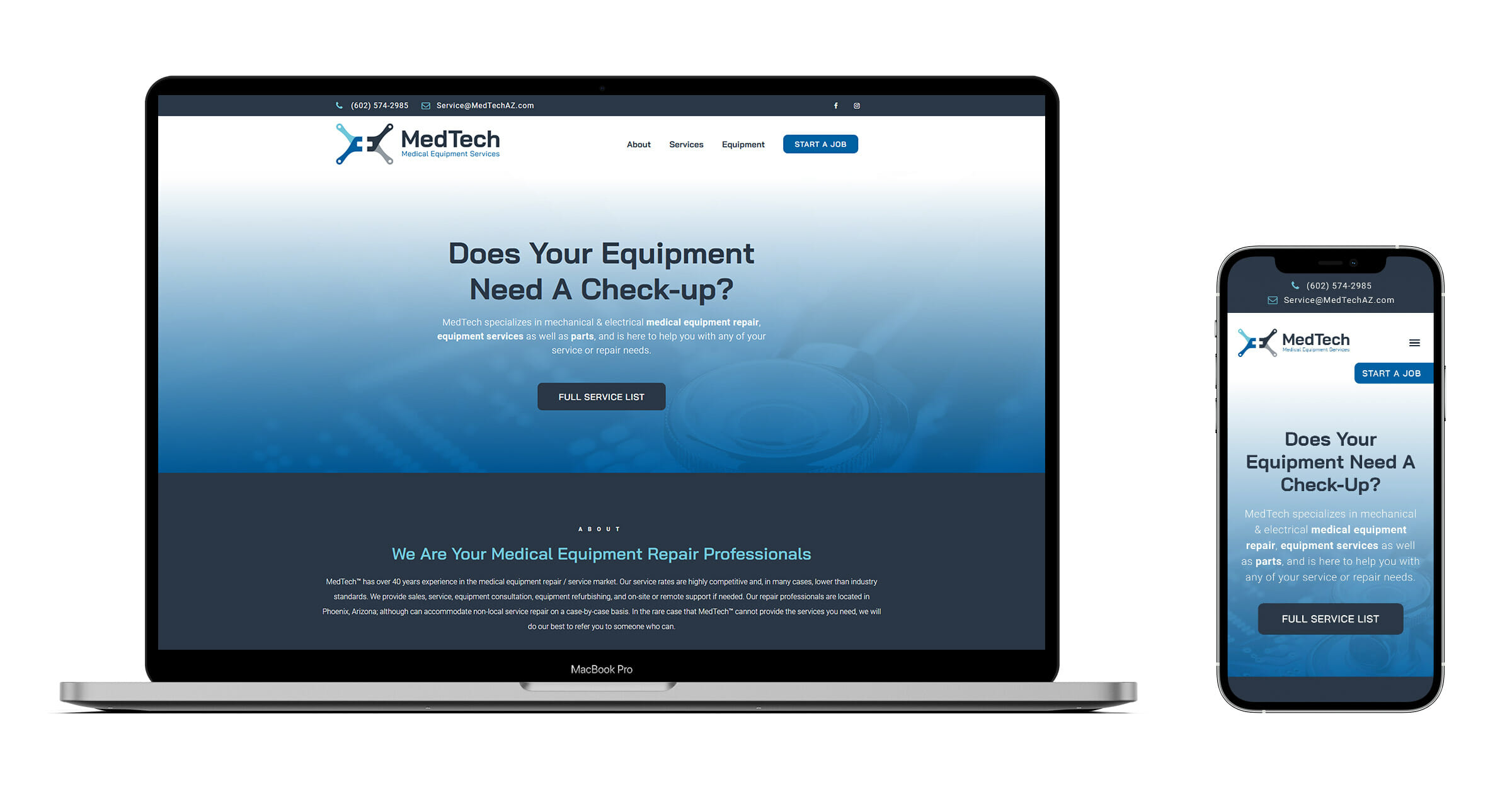
A web presence is a necessity, but doesn’t always require 10+ pages of content. For Medtech, we created an easy to navigate single-page website/landing page that has all the necessary info and functionality to start a job or request a quote.
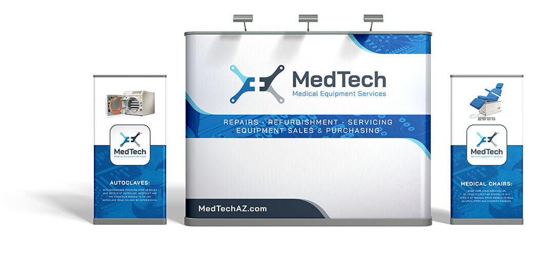
One of the best ways to get in front of medical professionals is through tradeshows, so we helped Medtech to create their tradeshow backdrop and banners.